Overview
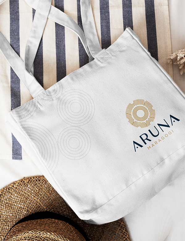
The Aruna logo is a harmonious creation of elements that capture the essence of the project, uniting the Indian origin of the word, the natural beauty of Alagoas, and the idea of community.
Elements
The design incorporates the sun, curved lines representing waves, and a representation of the human fingerprint to convey rebirth, hope, and connection to place.
Brand Goals
- Reflecting Cultural Heritage
- Symbolizes Renewal
- Symbolizes the Natural Beauty of Alagoas
- Promotes Community and Connection
- Versatility and Application
- Convey Hope and Positivity
About Colors
The color palette has been carefully selected to reflect positive energy and renewal. We used shades of gold and yellow to symbolize the rising sun and shades of blue and green to symbolize the Alagoas ocean and nature.
Application
The logo is versatile and can be applied to a variety of materials, including stationery, websites, social media, and promotional products, maintaining its identity and meaning in different contexts. The application of its rounded textures allows for many applications.
Aruna, the light of a new day


| Client | Aruna |
|---|---|
| Tourism | |
| Year | 2023 |
| Role | Graphic Designer |
| Art Director | |
| Location | Alagoas/Brazil |